Pantone's Colour of the Year 2026: If a yawn was a colour…
Every year, designers gather around like it’s Fashion Week for pigments, waiting with bated breath for Pantone to reveal the Colour of the Year, the sacred hue that will allegedly “define global mood” and also definitely be overused in 400 Canva templates by March.
And this year?
Pantone has graced us with… drumroll…
essentially white.
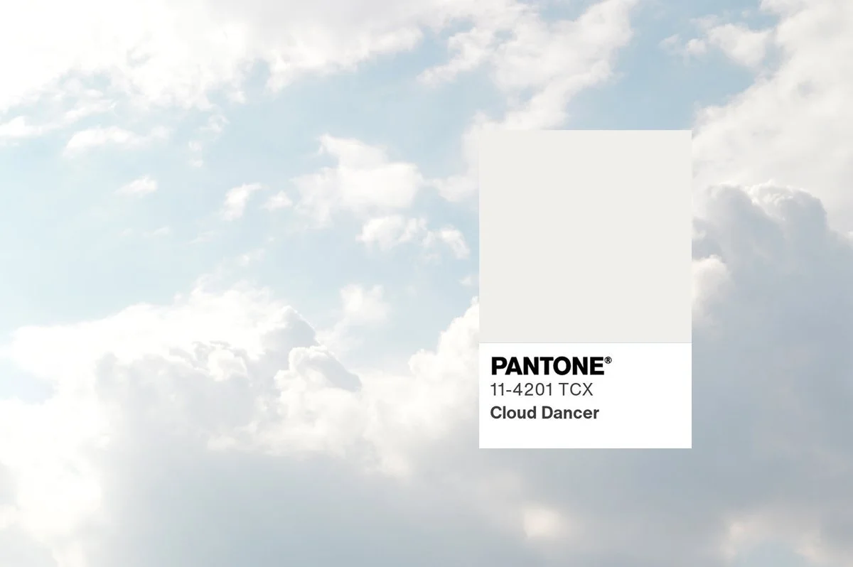
Yes. “Cloud Dancer.”
A colour so subtle, so pure, so visionary… that your printer will definitely interpret it as “my toner is running out.”
I’ve always had a theory about Pantone’s yearly pick: it’s less about design trends and more about the emotional state of humanity. If we’re choosing white, maybe we really are waving the white flag, for peace, for clarity, or maybe just for the collective burnout we’ve all been pretending isn’t happening.
Since 2020, the palette has been giving strong “we’re tired, please let us lie down” energy. In 2021 we got Ultimate Grey, which is basically “I give up” in colour form.
Then Pantone tried to cheer us up during the late-COVID haze with some brighter picks like Viva Magenta and Peach Fuzz, which, yes, successfully tricked us into feeling something for approximately 12 minutes.
——-
But 2025?
Mocha Mousse.
A soft, nondescript brown that looks like the colour of a latte left on your desk after a two-hour Zoom that could’ve been an email.
And now Cloud Dancer.
Honestly? Borderline insulting. The world is chaotic, geopolitically frazzled, economically confused, and AI is rewriting the rulebook while we’re still trying to find the paragraph on “What Even Is My Job Now.” And Pantone looked at all that and thought:
“Ah yes… white. That’ll fix it.”
White isn’t even a real colour, it’s the supporting cast member in branding palettes. It’s the background. The understudy. The friend in a rom-com who says “You’ve got this, babe!” before disappearing for the rest of the movie.
So if I had to describe Cloud Dancer in one word, it would be:
Yawn.
Pantone, sweetie.
We love you.
But you can do better.
——
If you’re wondering what colours I would choose for 2026? Easy, 80s mint green (the exact shade of vintage Tupperware your nan owns) or a punchy sunshine yellow. We could all use a bit more life!