Reviving a local icon, without losing its soul.
A brand refresh for a historic local theatre and cinema, designed to honour its legacy and reintroduce it to a modern audience.
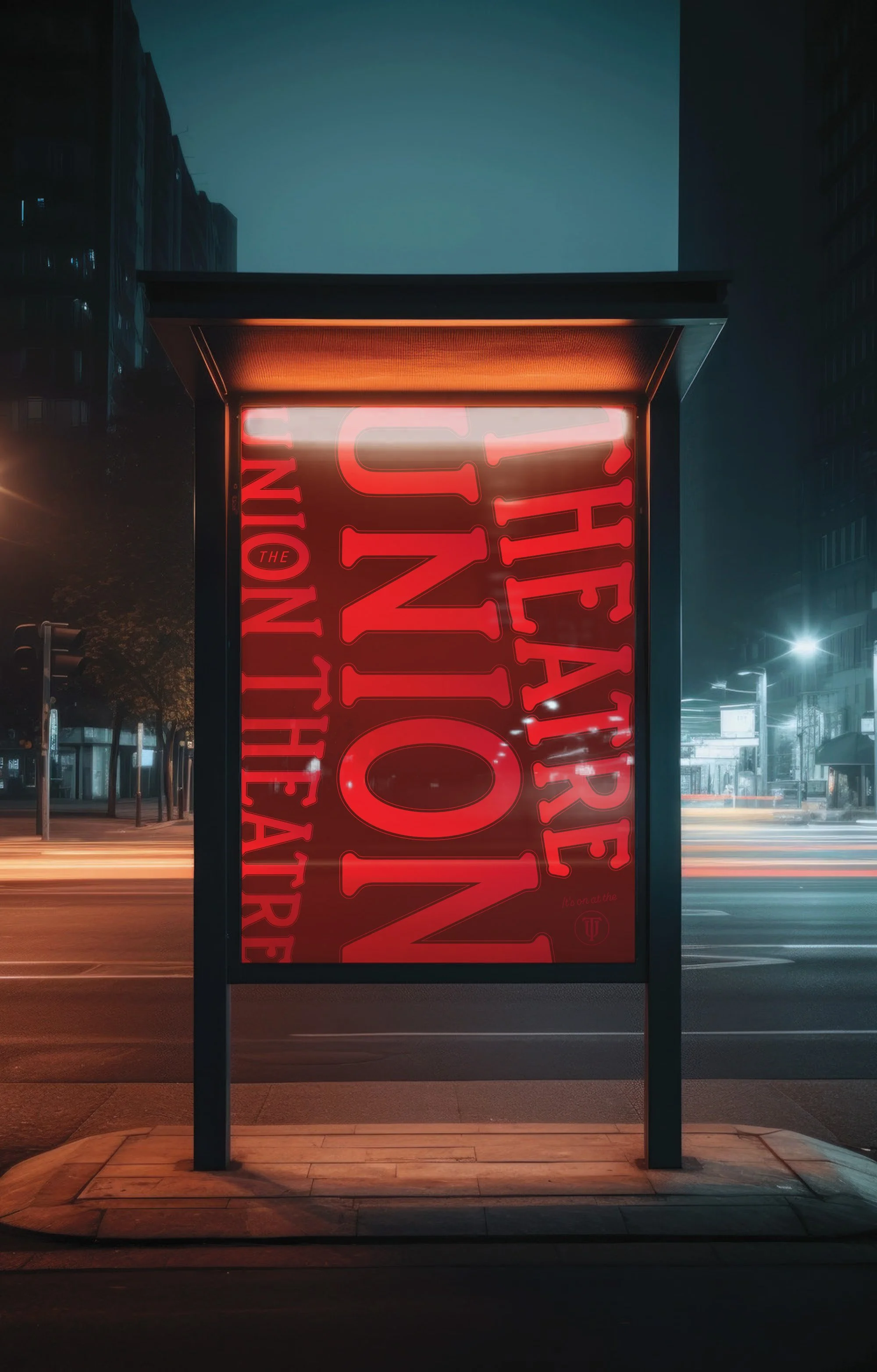



A new act for a 100 year old stage. Honouring the past, designed for today.
A well-established local theatre with over a century of history had strong community recognition, but its visual identity no longer reflected the quality or breadth of its programming.
The current marketing material felt inconsistent and dated, with no clear system to support ongoing and consistent marketing. The opportunity was to refresh the identity in a way that respected its heritage, while making it feel current, cohesive, and easy for the internal team to manage.
The Challenge
The inspiration came from the building itself, specifically its original typographic signage, which became the foundation for a contemporary identity, logotype and monogram.
The design direction balanced familiarity with clarity:
a typographic system grounded in the theatre’s history
a classic black base with a vibrant red to introduce energy and visibility
flexible, layout-led templates designed to showcase a wide range of events
Importantly, the system was built for day-to-day use. Canva templates were created to ensure the team could produce consistent, professional materials without ongoing design support.
The Approach


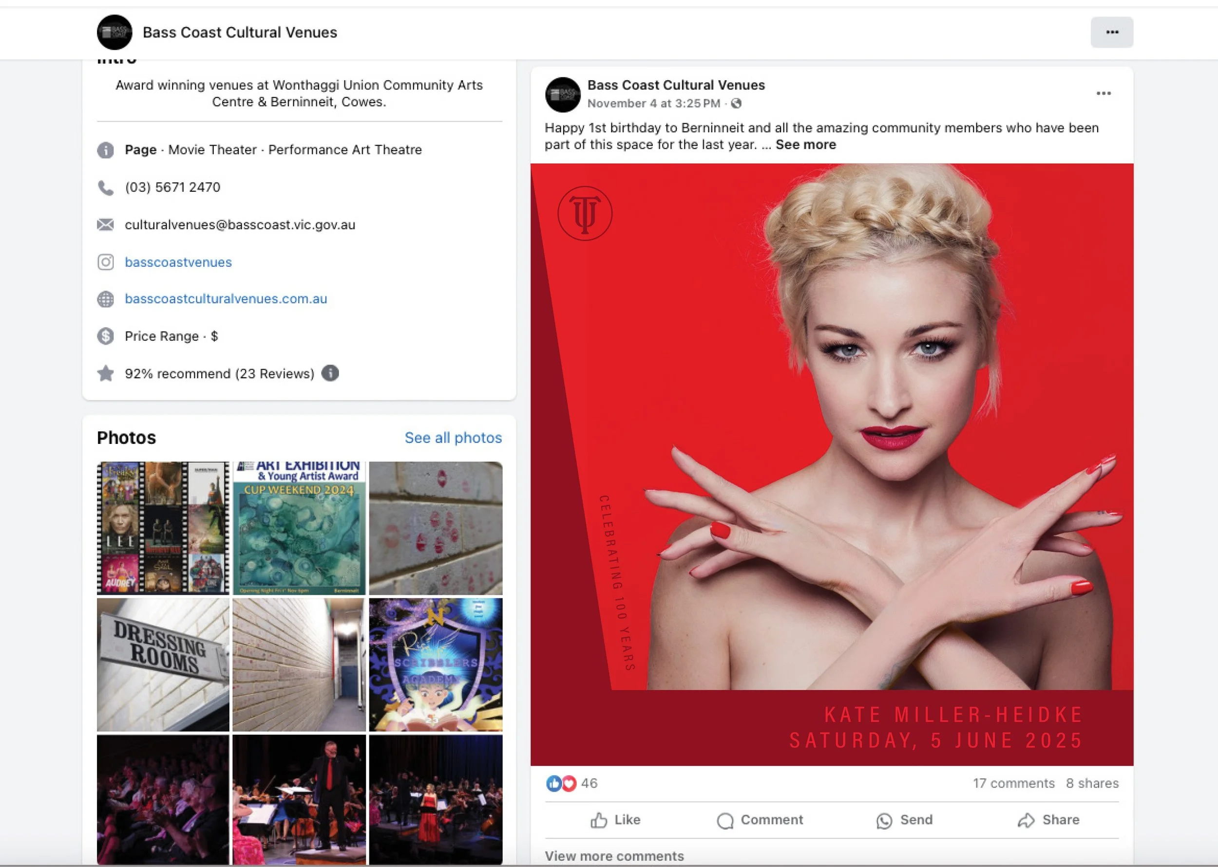
A practical design system that staff can confidently manage in-house using variety of Canva templates
Strong internal adoption, with the team taking ownership of the brand. Over 12 months on, the team continues to use the system consistently across all communications
Merchandise developed and sold on-site, contributing to renewed community pride
External flags and window decals, style guide, posters and commemorative program